Jason Nhan

Project Overview
First Impressions are everything! I created a brand identity, branding guidelines, mockups, a personalized poster, and a short animated gif to match the personality, skills, interests, and visual preferences of my client.
Objectives
-
Design a branding style guide and mockups for my client that reflect who they are
Project Scope
Branding
Tools
Adobe Photoshop, Illustrator
My Role
Designer
Duration
4 Weeks
Design Process
Research
Strategy
Design
Prototype
Research
Interview
My client name was Jason Nhan and he grew up in Toronto Ontario, and with the Pandemic it was hard to meet in person, the only way we could connect was through Zoom. I collected as much information I can and personality traits, stories and I got to work!
Ideation

Moodboard
Compiling my notes and other personal details I learned about my client to curate a mood board which would help me move towards creating a recognizable brand for him. This included curating possible colour palettes, visual elements, and exploring typography. Heavily inspired by his growth of highschool going from introvert to an extrovert and their personality changes.
Strategy

Logo
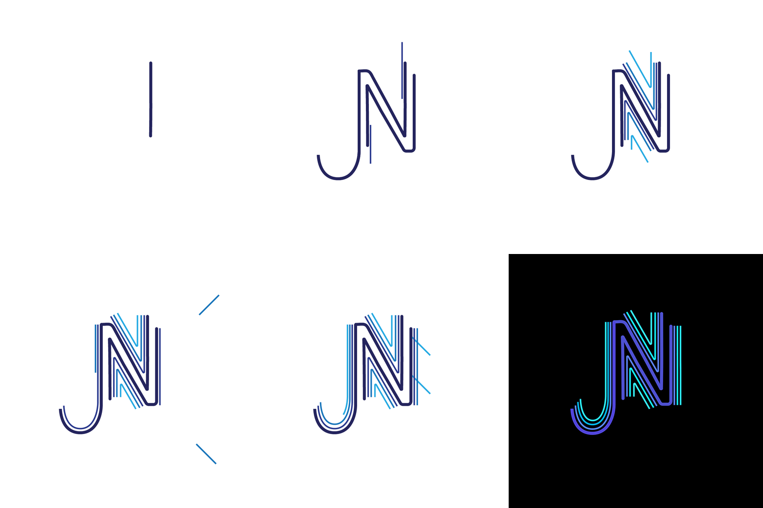
Building off of all my research and my mood board. I was able to brainstorm and sketch any potential logos and imagery that I felt encapsulated Jason's brand. I knew I wanted to incorporate elements from his experince in highschool and growth that happend during that period, such as colour, direction of lines, close promxity elements, and how it can seen as an illusion

Storyboard
Building off of all my research and my mood board. I was able to create a story from the beginning to the end to show the progression of light and dark. I knew I wanted to incorporate elements from his initials to show growth such as colour, direction of lines, close proximity elements, and how it can seen as an illusion.

Logo Design


Poster Design


Micro Animation

On the theme of growth I wanted to show a monotone logo and colours that show he is more of being extrovert. I decided that my micro animation would be a looping animation that involved elements of lines, letters and neon lights . I wanted the logo to appear to go from dark to light as it would show that the letters to "come-to-life" as the JN shows how it is forming into a personality. I mapped out my concept through a storyboard method with each scene helping me envision the viability of my idea.
